Website refresh
 Website refresh
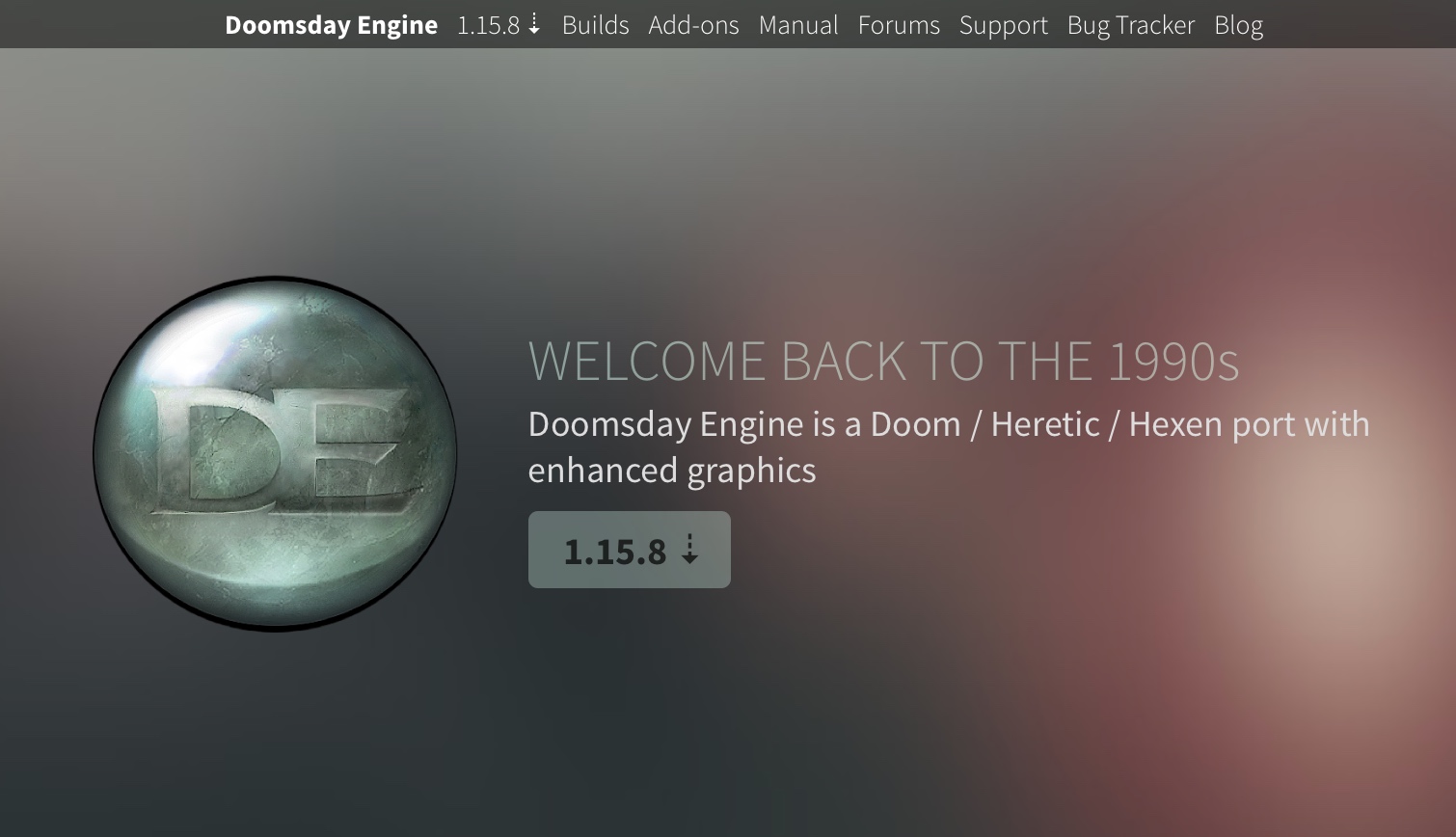
In preparation of the 2.0 release of Doomsday I have redesigned the dengine.net website from the ground up. The new design went live today. While the old design has been perfectly adequate during t…
 Website refresh
In preparation of the 2.0 release of Doomsday I have redesigned the dengine.net website from the ground up. The new design went live today. While the old design has been perfectly adequate during t…
Comments
I can think about making recent items more prominent in the design somehow, like we had the NEW label in the old one if the item was less than two days old.